Squarespace, Wix, or a custom website - which is right for your business? is rarely about one dramatic moment. More often, it is about patterns that repeat until they are impossible to ignore. At the centre of this topic is choosing a platform based on your next stage, not just convenience. When your website is aligned with your business, it feels easy to stand behind. Visitors understand what you do, and you feel comfortable sending people there. That quiet confidence matters more than people realise.
A helpful first step is to review your site as if you were seeing it for the first time. Notice how quickly you can understand the offer, the value, and the next step. If you have to work hard to explain your own pages, your visitors will feel that friction too. You do not need drama to make improvements. Calm, practical changes can transform the experience more than a full visual overhaul done in haste.
Why this matters
One of the most common issues is this: a quick choice can become limiting when your business grows. That does not mean you have made a mistake. It simply means your business has evolved and your website needs to evolve with it. This is normal for healthy businesses. The version of your site that served you last year may not be the right version for this year, especially if your services, audience, or confidence have changed.
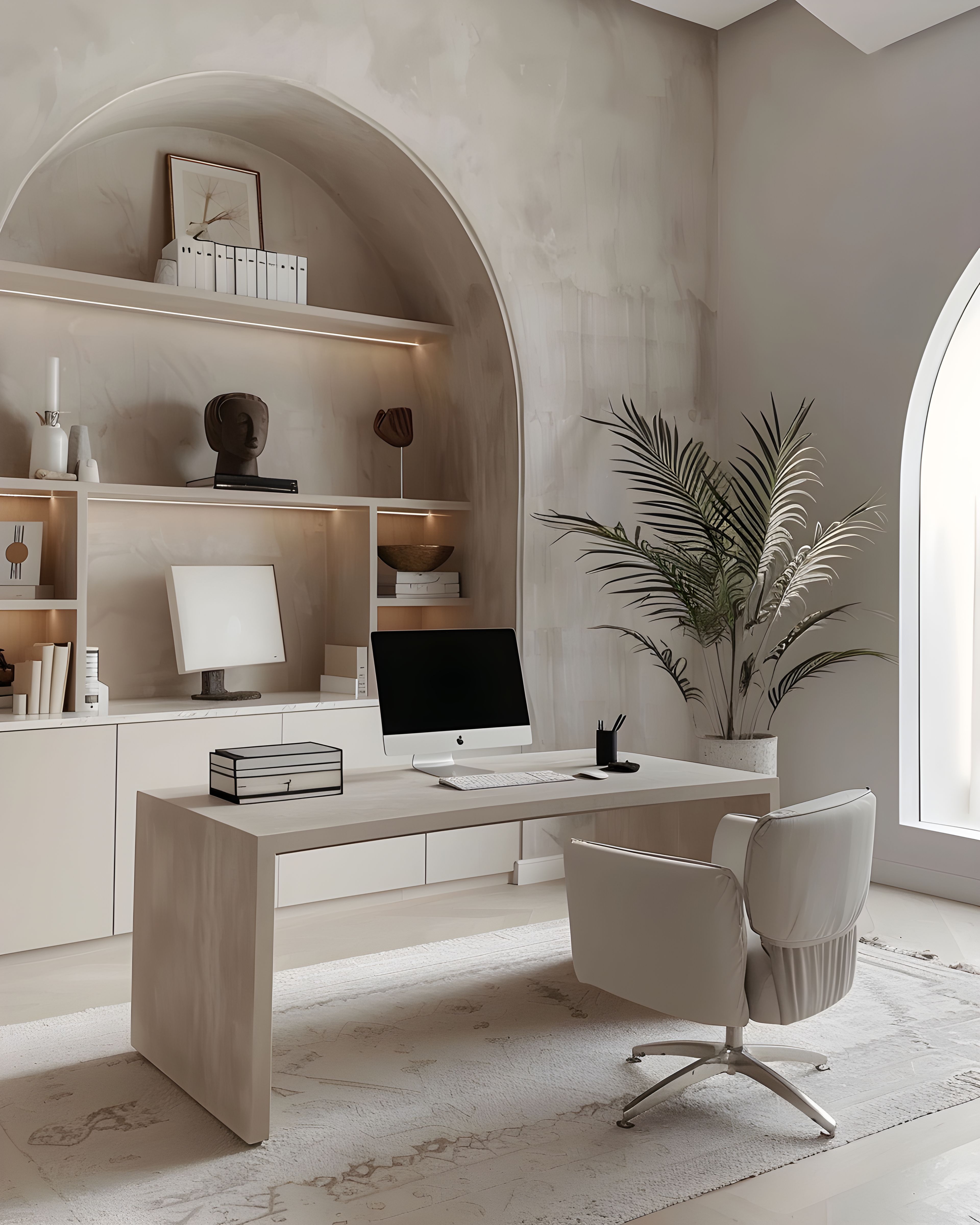
A better way to think about this is simple: the right platform is the one that supports your next one to two years. Your website is not only a place where people find you. It is also where they decide how they feel about your work. Every page contributes to that decision, from your opening sentence to your enquiry form. When the tone is calm and the structure is clear, people are far more likely to trust what they are reading.
Where many sites get stuck
In practical terms, start here: consider flexibility, editing confidence, feature needs, and long-term cost. Then look at your copy. Is it specific, plain, and human? Or does it rely on broad language that sounds professional but says very little? Clear language is not simplistic. It is respectful. It helps people make decisions without guessing. And when people do not have to guess, they are more likely to take action.
It is also useful to remember that thoughtful design is strategic, not decorative. Spacing, hierarchy, typography, and page flow all influence whether someone feels calm and confident or unsure and overwhelmed. A good website does not push people. It supports them. It makes the next step feel natural, not forced. That is where sustainable enquiries come from.
A calmer way forward
If you are leaning towards a bespoke route, Studio Sunday may be the right direction.